Newsarama reported that Bart Sears, whom I believe is an early example of an overrated artist by modern standards, is funding a new art book called Brutes and Babes:
Ready, set, draw! Published by Ominous Press, BART SEARS' DRAWING POWERFUL HEROES: BRUTES AND BABES was a huge success on Kickstarter, reaching nearly 300% of its funding goal. Now, DRAWING POWERFUL HEROES: BRUTES AND BABES VOLUME 2 is underway, with the Kickstarter campaign going live on Tuesday, Feb. 19.
[...] Acclaimed for his bold storytelling in comics including the million-selling Turok, Justice League International, X-O Manowar, Legends of the Dark Knight, and Violator from Spawn’s Todd McFarlane, Bart Sears taught an entire generation to draw with his Brutes and Babes column in Wizard Magazine. Bart presented dozens of drawing and storytelling tutorials, providing an expansive education in comic art and illustration.

I just don't get this. If you know where to look, there's examples from Sears' past portfolio that put his talents in question. For example, take this panel with Power Girl from Justice League Europe #7 in 1989-90, where Karen Starr looks facially more masculine than feminine, and this seemed to occur quite a bit during the first few issues. I don't think Sue Dibny and French JLE embassy chief Catherine Cobert suffered as badly in their facial design (nor Fire, also seen in the pic), but PG was most definitely the victim in Sears's art. If you think that panel on the side is bad though, wait'll you see
the picture at the bottom of the list on this page here, which makes her look alternately masculine or like an old hag. What would prompt Sears, early in his career, to make Power Girl look so surprisingly ugly in her facial design, botching the ability to give full credit for his work on her assets? Most other artists before and after usually had better results than this.
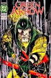
And that's not all. About 15 years later, Sears also drew a new volume of Captain America and the Falcon, and here's but a sample of his character design for the two of them:

In this drawing for the premiere issue's cover, the Star-Spangled Avenger and the Falcon have heads that look absurdly fat, like inflated balloons, not all that different from how Rob Liefeld drew Cap for Heroes Reborn, and the muscles look pretty dreadful too. You could argue Sears' style hadn't aged well by the time he got around to drawing this mess. And that's why I'm wondering: what's so great about Sears' design? In a way, he was an early example of the kind of mediocrity that struck comicdom in the past few years. There've been several examples of Marvel artists drawing women - including Kitty Pryde - to look masculine, and even more recently, I'd noticed one of the Spider-Man artists making Peter Parker look feminine in terms of his mouth(!), and what Sears did was like a precursor. It's not funny, and even if it were, the recent insults would only make the jokes look dated.
So why would anybody consider Sears a master, or his project worth crowdfunding? I can only assume it's the mainstream press pushing a false narrative, because in hindsight, Sears, alas, was not one of the best artists in past decades, and his art is more like brute than babe.
Labels: dc comics, dreadful artists, marvel comics, msm propaganda


1 Comments:
Different tastes for different people. How do you think Quitely's art stays so popular if this wasn't the case?
Post a Comment
<< Home